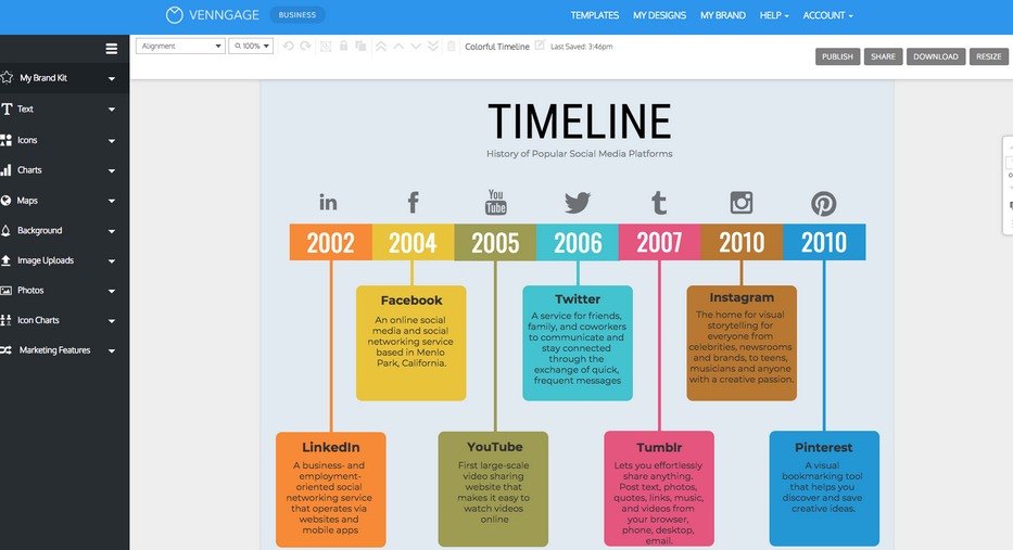
Timeline infographics is a kind of highly interactive chart that can help you to organize and highlight important dates in a visually attractive manner.
They have a simple linear structure, colorful graphic, attractive icons, cartoon and a lot of stuff which enhances its appeal. The non-complex interface of these infographics also makes them an easily understandable option for presenting long timeframes to the consumer.
The interesting part of this infographic is that it’s easy to create than a full-length blog.
Have a look at the simple step that you have to go for making a highly engaging timeline infographic.
Create a Rough Outline
The timeline infographics that you are creating has to serve two purposes at the same time, attract viewers, and provide precise information. It means that there will be some part of the data that you have to show and some unimportant that you have to avoid.
Therefore, start the process by collecting the content and separating the more crucial information. You will also have to calculate the number of dates, descriptions, heading, and images that you will be showing in your timeline infographics.
Sort out the most important dates, write short summaries for them and choose the icon or graphic that goes well with them. It will help you to know the overall stretch of the infographics and hence the design layout you will need.
Pick A Road Map
Once you have the data and the artwork, choose a layout, the next step will be to find a pathway to arrange them. Based on the content you have, there are three types of arrangement that you can choose for the infographics.
Vertical: This infographic layout is the most popular data road map. It consists of a center or left aligned lines which run vertically through the graph. The route will have some branches coming off from the sides of the mainline and present the text related to that particular point.
Horizontal: the horizontal layout is much similar to the vertical timeline, but its branches come out from only one side, and it has limited data points. Usually, you can create only 6-7 time points on it before things start to look messy.
Snake: In snake layout, the timeline spread all over the page like a snake. It is a preferable representation form when you have too many time points. It is attractive, spacious, and the most preferred layout for link building and enhanced business recognition. However, it has a limitation on the text length that you can include.
Create the Framework
Once you have decided the layout, start arranging your data. Select the size of the page that you need, divide it into sections for the data like text, titles, and timeline.
After the page layout is ready, create the line for the representation set the data points for the initial base structure of the framework.
You can also customize the color tone, size, and all the other aspect of the page to make it look clean and organized. Use of some customized balloons, clouds, and other stuff to represent branches and makes space for the content, is also a good idea.
Another good approach for this aspect will be to go for a timeline creator application or website. There are a lot of user-friendly timeline creator tools on the internet that will let you drag and drop everything to boost the speed of work and simplify things.
Add the Content
Now that the Skeleton structure of your timeline infographics is ready, it’s time to add the detailing to it. Contact some content writing services to create interactive short descriptions, drag some photos, select the header, and fill in all the other stuff you need in your timeline infographics.
Finalize the Visual
After the placement of the primary data and images, the infographic is practically ready for the roll. So, the next part will be to improve its designing features and color schemes.
In this part, you personalize the theme of the graph, adjust the tints or tones, and include some interesting shapes or vectors to make thing more popping. You will also make the necessary changes to the color and size of the text that you are using. It has to be simple yet precise and readable.
Conclusion
The above steps walked you through the whole process of creating, personalizing, and decorating a timeline infographic for representing the historical events at a glance.
So, browse the internet, find some trending topic, and get down with this highly visual content for improved engagement of your website.
And do remember to combine it with the latest business blog post ideas that you are adopting. You will be surprised by the result of this blend.