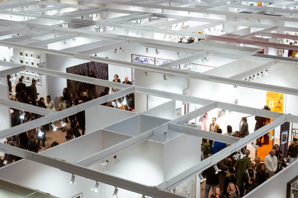
Ever wonder why some booths are busy and others are virtual ghost towns at a tradeshow?
Yeah, it’s not the free candy. It’s not the fishbowl full of business cards. Exhibitions are won and lost on smart, intentional booth design that catches an attendee’s eye before they even realize they’ve stopped walking. Master that and you’ll notice:
- More qualified leads
- Higher on-site conversions
- Better ROI on the whole show
And the best part?
The majority are incorrect. Which allows those who are correct to shine.
Let’s break it down…
Why Booth Design Matters More Than Ever
Trade shows are serious money. The U.S. B2B trade show market exceeded $15.5 billion in 2024 — and every exhibitor at every show is fighting for the exact same pool of eyeballs.
Here’s the problem:
Booth Visitors walk at a hectic pace. They visit hundreds of booths each day of the show. If your booth doesn’t catch their attention in the first 3 seconds they will walk right on past.
This is where many exhibitors fail. They rent the floor space for thousands of dollars and then throw up some carpet and a folding table with a flat screen hanging in front of it. That’s not exhibitor branding. That’s just lazy. Partnering with knowledgeable Orlando trade show booth designers can mean the difference between having a booth that’s avoided and one that attracts a crowd because they understand how sightlines, lighting and traffic flow affect foot traffic patterns at busy trade shows.
The statistics prove it. 48% of exhibitors believe that eye-catching displays draw the largest crowds – more than any other factor. That’s significant.
Great booth design isn’t decoration. It’s a lead-generation tool.
The Foundations Of A Traffic-Stopping Booth
Add lights, screens and gimmicks later. Master the fundamentals first. All successful booths are based on these principles.
Imagine building a house. You don’t hang wallpaper before the foundation is poured, do you?
The core foundations of great booth design are:
- Friendly Floor Plan: Receptionists shouldn’t turn visitors away with castle walls around their desks. Avoid the towering-counter in front-of-house designs.
- Clear brand messaging: Someone visiting your booth should be able to tell what you do within 3 seconds of glancing at the booth.
- Bold graphics near the top of the booth to create strong sightlines from across the aisle.
- Great lighting: Well-lit booths look premium. Dim booths look like a warning sign.
The magic trick here is that they all complement each other. A booth that’s well lit with clear signage and open floor plan will trump a $100k booth with sloppy graphics every time.
That’s the secret most rookies miss…
Exhibitor Branding That Sticks
Exhibitor branding makes your booth more than just a temporary structure. It creates a memorable brand experience.
Here’s a simple test:
Take your logo off your booth. If people attending your show won’t know it’s you, then you need to work on your branding. Effective exhibitor branding should make you INSTANTLY recognizable…from 20 feet away.
A few branding rules to live by:
- Use 2-3 brand colors max, not the entire rainbow
- Keep the logo big, clean, and elevated
- Use consistent fonts across every graphic
- Tell one clear story — not five competing ones
One clear message beats five confusing ones. Every time.
Take for instance a medical technology brand that recently integrated a subtle color gradient on the flooring to unconsciously lead visitors from the aisle directly to their demo area. Nothing fancy. Just clever thinking. This new simple design generated 27% more demos compared to their prior show.
That’s the power of intentional exhibitor branding.
Make The Booth Photo-Worthy
People who attend trade shows love to take pictures and post on LinkedIn. Give them something to post about.
Photo-worthy “moment” content inside the booth is free marketing. Each time someone shares a photo of your booth to their network, that’s another several hundred (or more) people looking at your brand — at no cost to you.
A huge neon sign. A gigantic replica of your product. A huge screen showing a live demonstration. All of these will do. Just be sure to also have your logo or company name somewhere in the picture as well. Otherwise you’re just wasting exposure.
Interactive Elements That Pull People In
Static booths are boring. Interactive booths are magnets.
When you add something for people to do at the booth, it completely transforms it. They have a reason to pause, interact, and linger. The longer people linger at your booth, the more likely they are to turn into a lead.
The best interactive elements include:
- Live product demos
- Touch-screen displays or games
- VR / AR experiences
- Live challenges or contests
- Giveaways tied to a quick activity (not just handouts)
The key with interactives is SPEED. You don’t want guests spending 20 minutes playing your game at your booth. But…2-3 minutes? Perfect!
And here’s the kicker…
Engaging booths hold attendees significantly longer than average. That equates to more time pitching, qualifying and capturing leads. That’s what it’s all about.
Common Booth Design Mistakes To Avoid
No matter how large their budgets are some brands fall into these booth design traps year after year. Avoid these:
Mistake #1: Blocking The Entrance
Large tables at the front make participants feel like they’re about to be sold. Negative energy. Deconstruct it.
Mistake #2: Text Overload
No one stops walking to read a paragraph. Use short punchy phrases. Let the visuals do the talking.
Mistake #3: Staff Standing In A Line
A line of arms-crossed staff creates a vibe of airport security. Space them out and point them towards the aisle instead.
Mistake #4: Ignoring The Floor
Floor space at your booth is important visual territory. Consider branded flooring or a statement rug to attract eyes from afar.
Mistake #5: No Clear Call To Action
Each booth should have one obvious next step. Schedule a demo, scan a QR code, enter a raffle. Without something tangible for leads to do, they walk right on by.
Steer clear of these five, and you’ll already be ahead of 50% of the show floor.
Bringing It All Together
Great booth design isn’t about having the biggest budget. It’s about being thoughtful with every square foot.
To quickly recap:
- Nail the foundations before adding gimmicks
- Make exhibitor branding instantly recognizable
- Add one or two strong interactive elements
- Give attendees a photo-worthy moment
- Avoid the five common design mistakes above
Your trade show floor is a highly competitive marketing arena. Making your booth design work smart is why it pays off.
An attention-grabbing booth that actually stops foot traffic doesn’t just look cool. It creates leads, builds tangible brand awareness, and costs your brand many times its initial ROI. When you design it right, they will come to you.
Enjoy Worthview?
Add Worthview as a Preferred Source on Google to see more of our stories in Search.

Sethuram Kishore is the founder and editor of Worthview, an online publication established in 2008. With over 18 years of experience in SEO, digital marketing, and online publishing, he writes about AI, technology, business, and digital trends. He is also the founder of MoneyHulk, a personal finance and business publication.