Owning a home has many advantages over renting. To start with, you have a sizeable investment to call your own once you’ve finally paid down that pesky mortgage. Secondly, you’ve got something to leave for your kids. Thirdly, you get to decide what to do with it.
Don’t like that wall between your kitchen and dining area? Knock it down. Sick of those ceiling fans? Install some air conditioning. Want to extend out the back or build a bungalow? Go for it. Is the paint scheme just awful? Well get out that paint brush or hire a painter. But wait! Before you do you need to ensure that your colours are consistent. Read on to find out exactly how to achieve this.
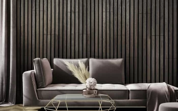
Pay Attention to Your Furniture
Before planning that big painting project you need to stop and assess the rest of your house and have a good think about the palette. The first place to look is at your furniture. Does your upholstery fabric match the paint scheme that you had in mind? Are you going to need to reupholster your couches and chairs? Is it going to be cheaper to buy a brand new lounge suite rather than alter your existing one? These are all the things you need to consider before you go out and buy those tubs of paint.
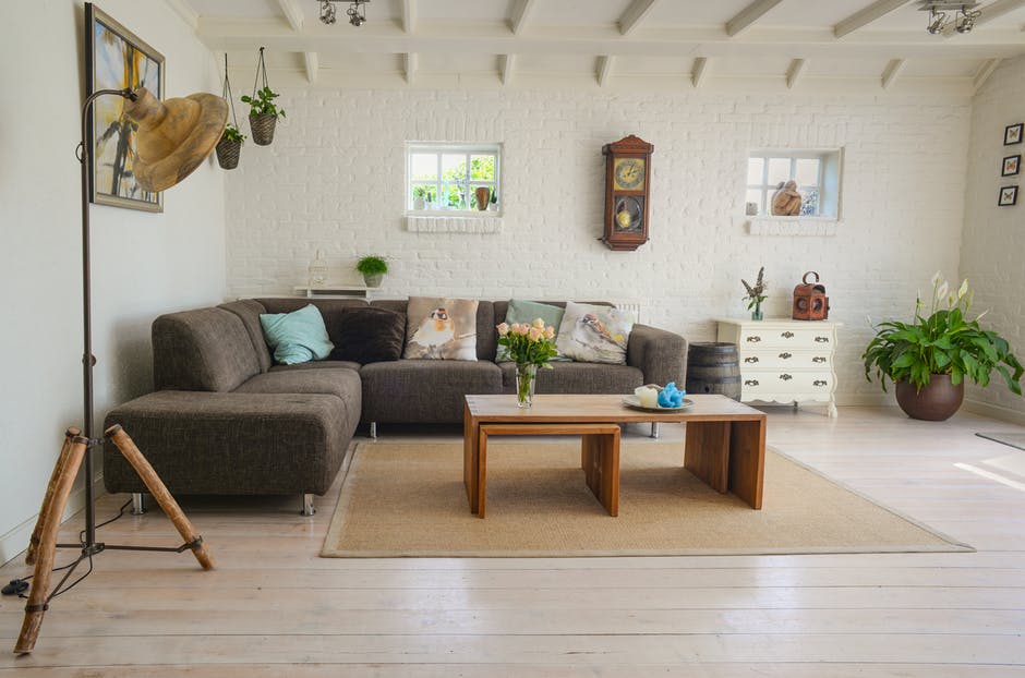
Flooring Matters, Too
Have a think about your floors. Are they light, dark or somewhere in between? Dark wooden floorboards may not match lighter tones of paint such as whites and creams and you may have to consider a darker tone of wall paint. That being said, you may be aiming for stark contrasts and comparisons and a light tone may be just the ticket. But if you’re aiming for consistency, be sure to match your floors and walls.
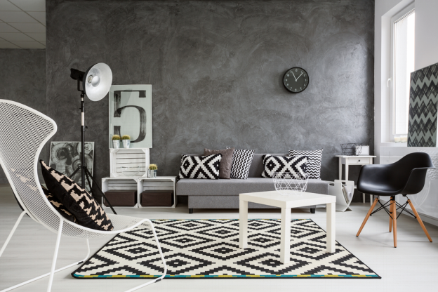
It’s the Little Things that Count
Did you know that you can achieve colour consistency through careful consideration of your decorations and additions? For example, a well-placed throw cushion on your couch that perfectly matches the colour of your ceiling is a beautiful touch that a discerning guest will surely notice and compliment you on. That statue in the corner that matches your drapes? Perfect. While we’re on the topic of drapes…
Window Dressings Are Important
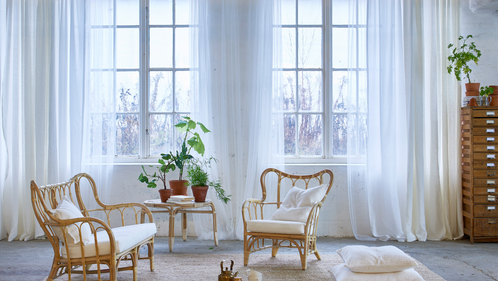
The colour of your window dressings play a strategic role in your mission to achieve colour consistency across your dwelling. If you have white or cream walls then invest in some white or cream curtains. Lace is always a good choice here, although the insulation provided is not ideal. If you are opting for darker, more sombre tones, then get some heavy drapes to match. If you want to get creative then you could opt for light flooring, slightly darker curtains and a darker still ceiling, or flip that around the other way. You’ll have consistency with contrast! The best of both worlds.
Don’t Forget the Art
Another way to keep consistent is to ensure that any artworks you hang mirror the tones of the rest of your interior. If you are going for soft neutral tones then a few soft, neutral prints or photographs are the way to go. If you’re being bold and colourful – a Picasso! You get the idea.
Have Fun
Decorating your home should be a load of fun, so remember to enjoy it. Consider the color of your furniture upholstery, and ensure your flooring and walls match. Pay attention to the little things like throw cushions or statues, and don’t neglect the window dressings. Finally, top it off with some matching artwork and voila!

Loves home. I am here to provide how to make your home a much better place. 🙂 Blogging about HomeDecor, Home Improvements and more.